Field Notes
An independent publication about architecture and attention.
- My role
- Editorial design & typography
- Format
- Publication / Layout / Type
- Status
- Self-initiated publication study
A different pace of reading.
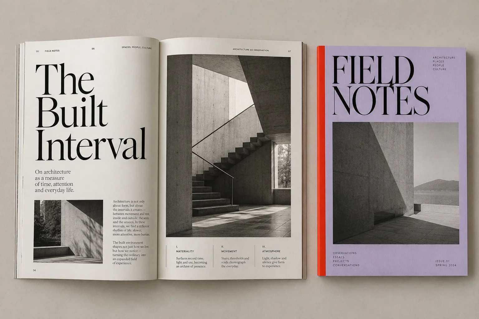
I was interested in the way a page can slow you down. Large type, a quiet photograph, and enough white space can change how a story is read.
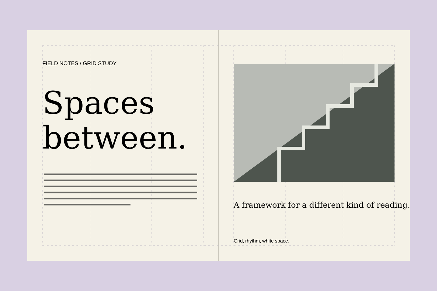
Field Notes is an imagined magazine about spaces, people, and visual culture. The design sets generous serif headlines against smaller, structured text, letting a photograph occasionally take over the page.
The grid is a framework rather than a rule for every spread. Short captions, full-page images, and deliberate changes of scale give the publication a rhythm. The mockup and layout studies illustrate the concept; this is not a published title.